Parts of Speech: Interaction Design (Week 2)
Jump directly to the interaction by clicking here.
As part of the Design Engineering program at the Harvard Graduate School of Design, I’m taking a class called Parts of Speech: Reimagining Computing Through Verbs, taught by Jenny Rodenhouse. I’ll attach a brief excerpt from the syllabus here:
Every interface is built from actions. We boot, click, swipe, friend, and cancel; each verb carries a history and a worldview about who and what computing is for. With large language models (LLMs) and text-to-form tools, a word can call a world into being in seconds, so choosing how to order a few letters is also a way of building one. This seminar takes verbs as its subject, studying how form and time direct a person to act.
Each week, we do a verb study. This involves:
- Selecting a verb in response to a particular era of computing, researching its origins, etymology, and history through four lenses—illustrative, abstract, emotive and antithetical—and representing these through a type study.
- Deconstructing each artifact through elements of design: line, color, shape, form, space and composition, texture.
- Sketching the interaction at a low fidelity, before building an interactive version of it using code.
Week 2:
We had to select a verb associated with the “Manipulate” era of computing, specifically in response to the verb “click”. I chose the verb “clear”.
I liked “clear” since it has meanings both as a verb and an adjective. I also felt like it was interesting to think about how computing as a medium enabled “clearing” something away at the click of a button, similar to “undo”. So much so, that the action of “clear” is often abstracted to be just an icon: .
Here are the type studies I did based on 4 different definitions of “clear”:
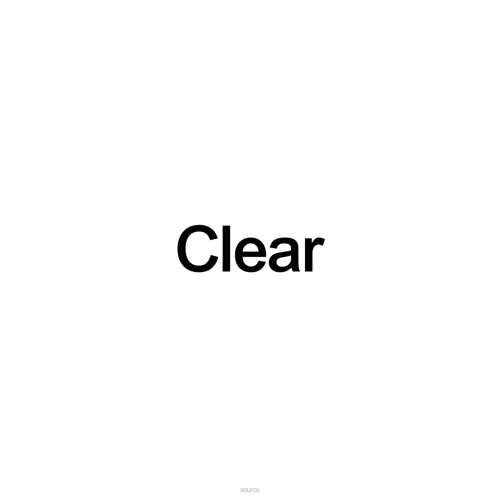
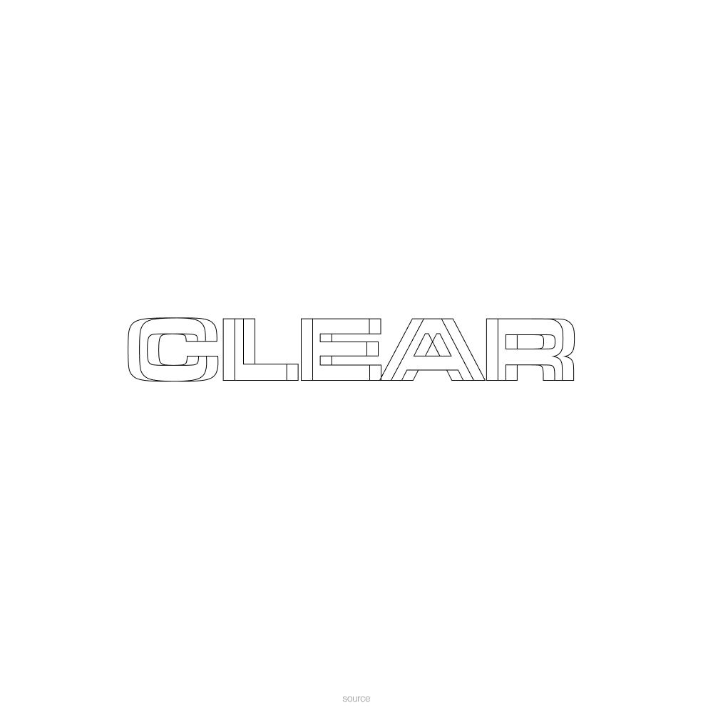
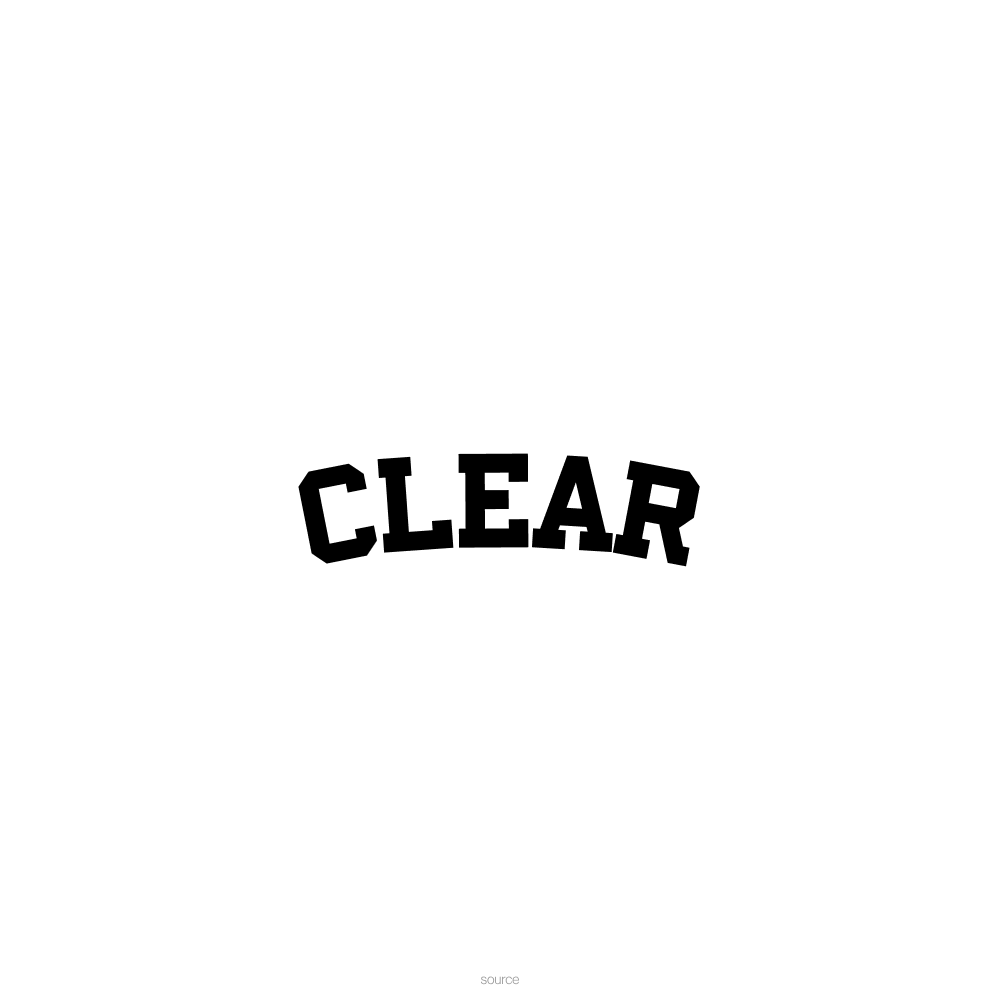
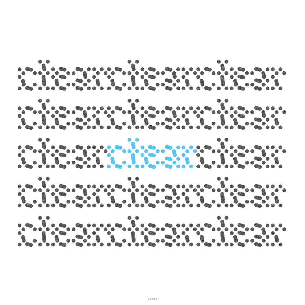
To make intelligible.
I was really inspired by this Button Stealer Chrome extension (pictured below), which randomly “steals” buttons from websites as I browse the internet and creates an archive of sorts.
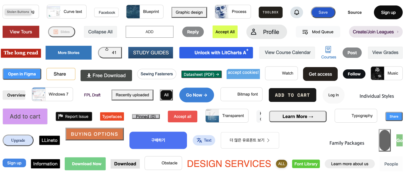
I connected this to the phenomenon of the many fake download buttons or “clear” ad buttons we have to contend with when on a “sketchier” part of the internet (such as on sports streaming sites). One wrong click, and you’re screwed — the interface probably gets populated with even more popups, a new tab showing an illicit website of some kind, or possibly a dangerous .exe in your Downloads folder. Browse with caution! None of this actually happens in the interaction below, so don’t worry.
FYI, there is a secret button each time that actually works to clear the screen. Reveal the spoiler to learn how!
I had fun demoing it in class and got good feedback! It could be interesting to abstract it a bit further, especially in the context of drawing or design applications, where ‘clear’ is a superpower that is most different from real life. This interaction ended up being closer to a piece of “net-art” than a pure interaction.