Role
- Designer
- Web Developer
Timeline
- September 2025 - October 2025
Skills
- Design Research
- Data Visualization
- Web Development
Technologies
- SvelteKit
- Tailwind
- Mapbox
- GSAP
Overview
How can we convey the acoustic conflict between human activity and marine life in Monterey Bay, California?
Ship strikes, which are collisions between vessels and marine animals, are the leading cause of whale deaths worldwide.
Most ship strikes go unreported, since the animals usually sink to the ocean floor if they die, making it difficult to assess their true impact on marine populations.
Shipping vessels emit similar sound frequencies as whale species, which disrupts their ability to communicate and navigate, making them more prone to strikes.
Approach
I worked with a partner to research, design and develop this data visualization project, completed as part of my Master's in Design Engineering program at Harvard University.
We found a NOAA dataset that contained over 4 years of continuous underwater acoustic recordings from the Monterey Bay National Marine Sanctuary in California. Monterey Bay is home to 36 species of marine mammals and one of the busiest shipping lanes in the world, with over 800,000 gross tons of cargo passing through annually.
We used the NOAA data in conjunction with Google DeepMind's machine learning model, Perch 2.0, that can accurately classify different whale species and human-made sounds from underwater acoustic recordings.
Our interactive web-based data visualization, Ocean Records, allows users to explore the underwater soundscape of Monterey Bay, highlighting the presence of different whale species and human-made sounds such as ship noise and fishing activity.
Solution
Map
The main landing page features an interactive globe. When the user clicks 'Enter', the map zooms into Monterey Bay and shift to the left to reveal the main content.
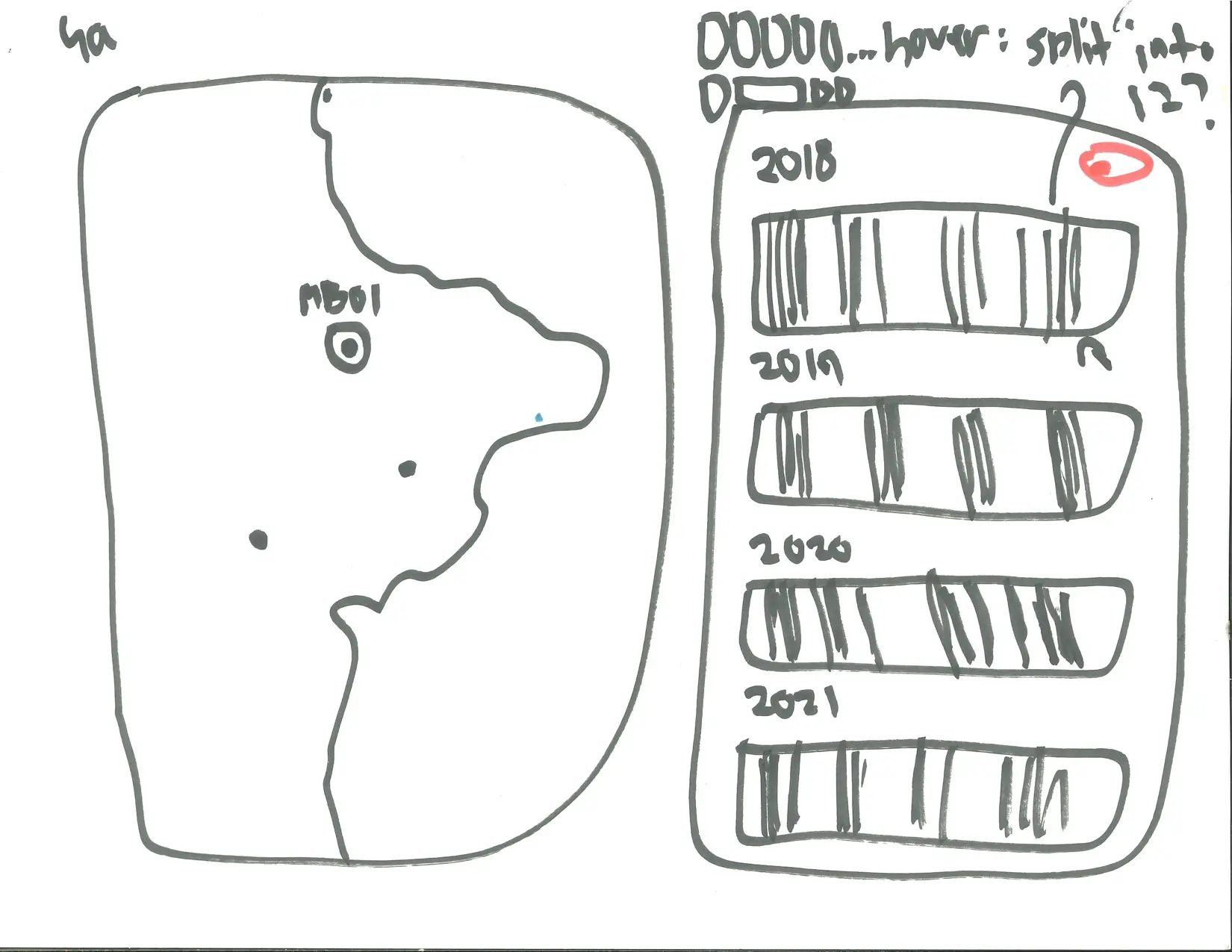
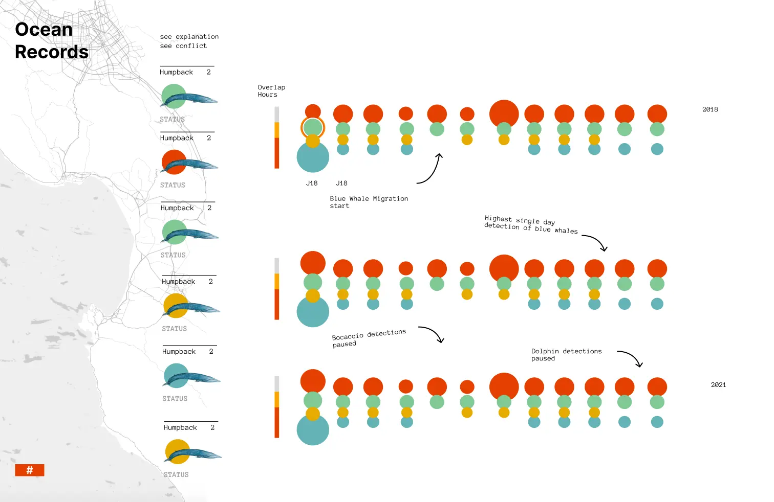
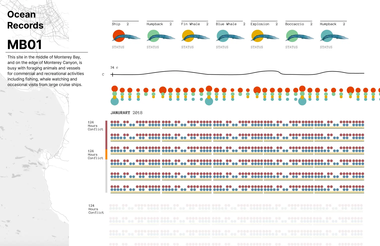
Year View
This view shows the map, a legend of the different sound types and a grid with each month. The sound detections grouped together in stacked circles, with the size of the circle corresponding to the number of detections.
Hovering on the circles shows the exact value as well as plays the corresponding sound for that activity or animal that is visualized in the sidebar.
Toggling between different sensors in the map updates the data visible for the selected sensor in the main view.
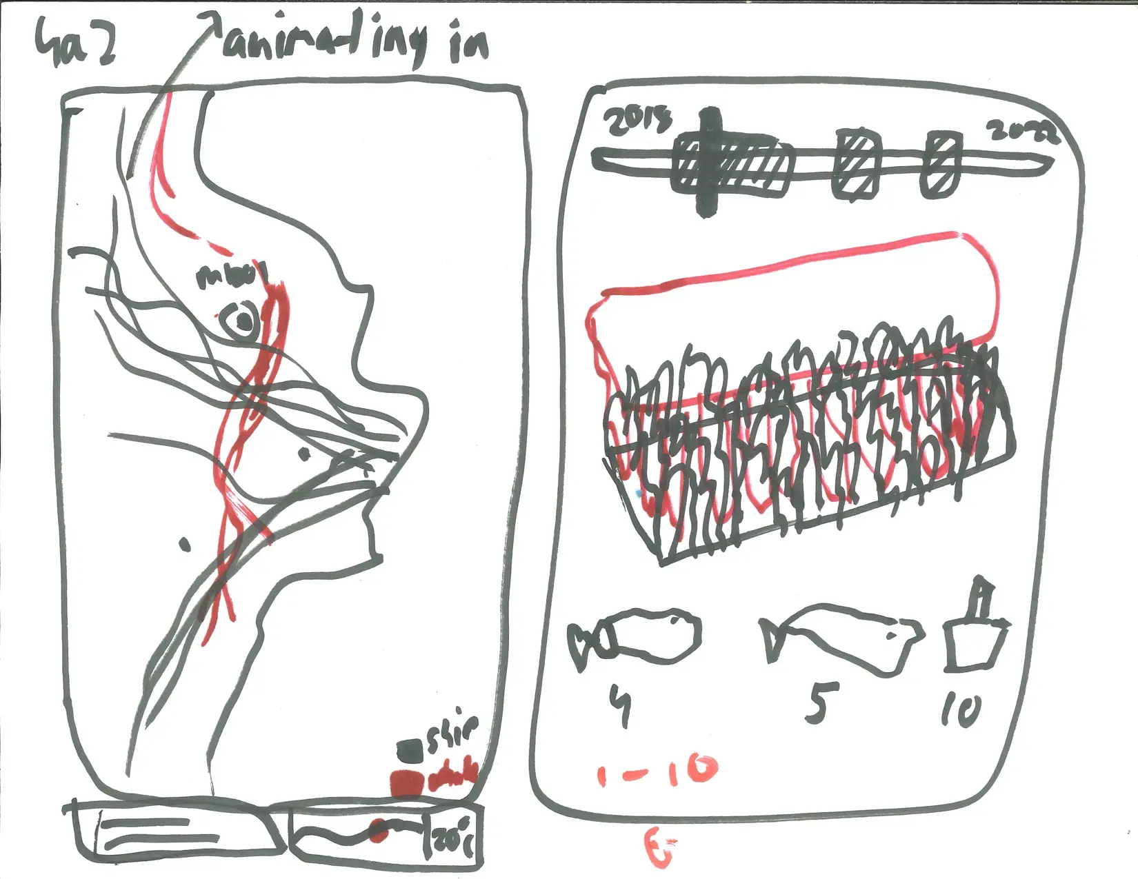
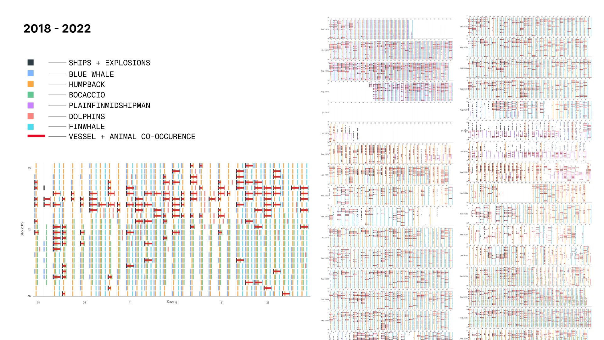
Month View
Clicking on a month leads animates all the months into a timeline, showcasing the pattern of detections across all 4 years.
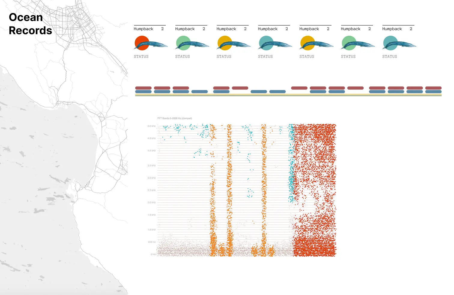
Below this, a grid of each day in the selected month is visible, with hourly indications of when sounds were detected on that day.
A filled in circle indicates a presence of that sound and a line is drawn between circles each time human activity and sound overlap in the same hour.
Process
Ideation
We undertook an extensive research and ideation process to understand the problem space and develop our approach. Some highlights included talking to the authors of Google's Perch model, NOAA officials and doing desk research to understand the marine ecosystem in Monterey Bay.
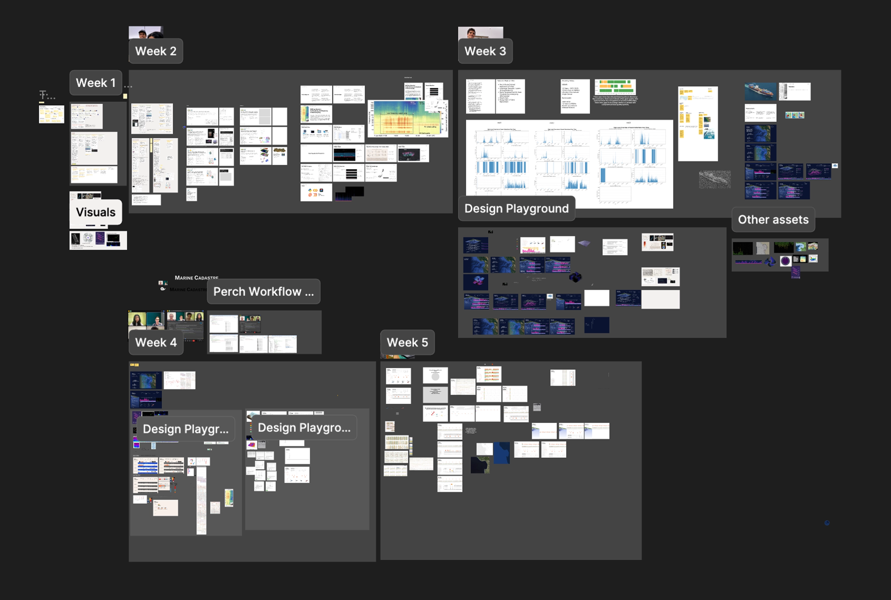
Overview of our Figma file across the 6 week period
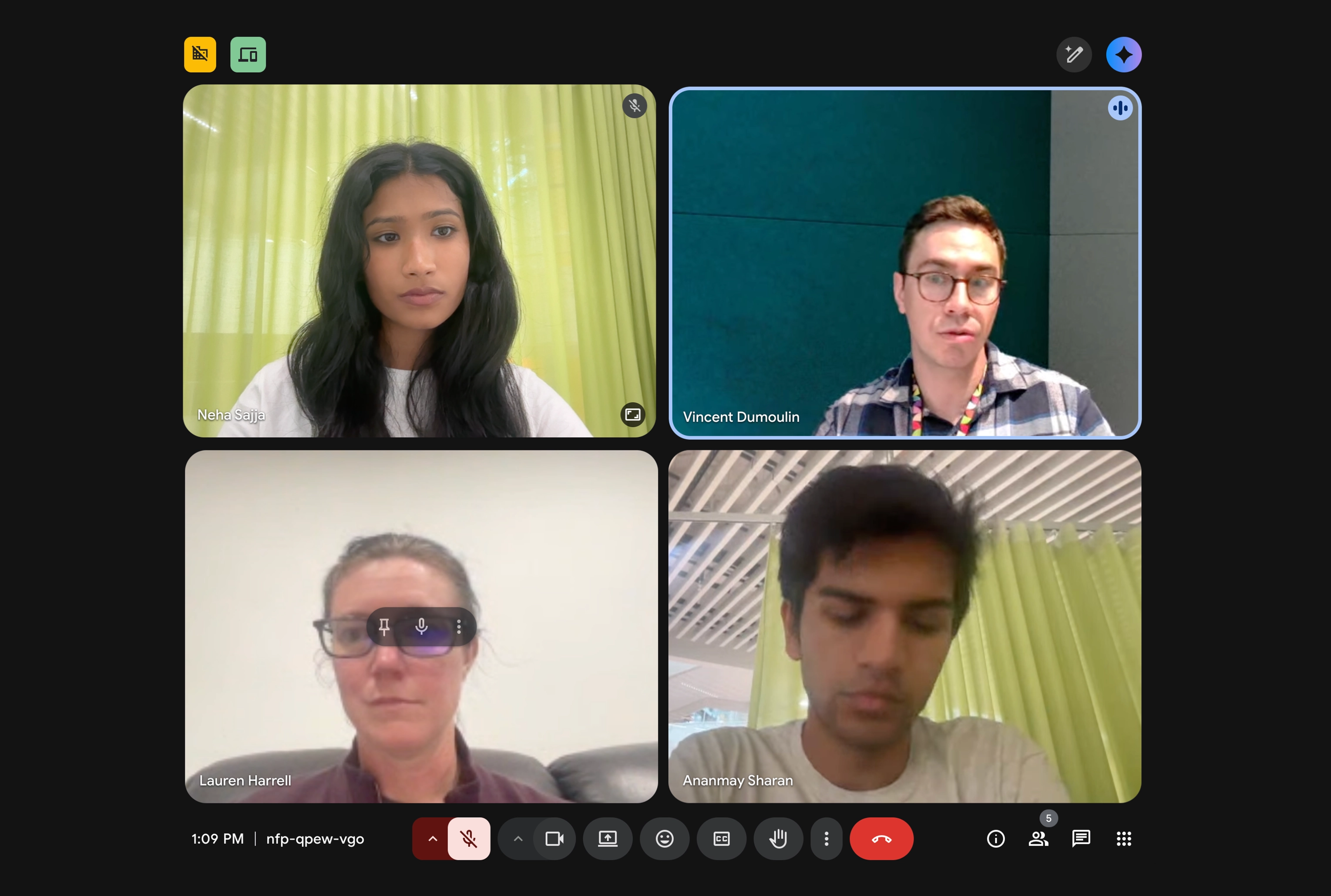
Talking to Google DeepMind scientists
Understanding Sound and Precedents
We developed an understanding of how different sound frequencies are visualized through spectrograms in marine bioacoustics. Simultaneously, we explored various sound based data visualization precedents, including Google's "Pattern Radio", The Pudding's "They Won't Play a Lady-O on Country Radio" and MIT Media Lab's "Sonic Cities".
Based on these initial explorations, we developed some early concepts for our visualization. They look quite different from our final solution, although some key ideas carried through!

Exploratory Data Analysis
Simultaneously, we processed the NOAA dataset using Python to understand high-level patterns across the 4 years of recordings from 3 different sensors. We found that NOAA had conducted their own detection analysis and wanted to explore the shape of this data.
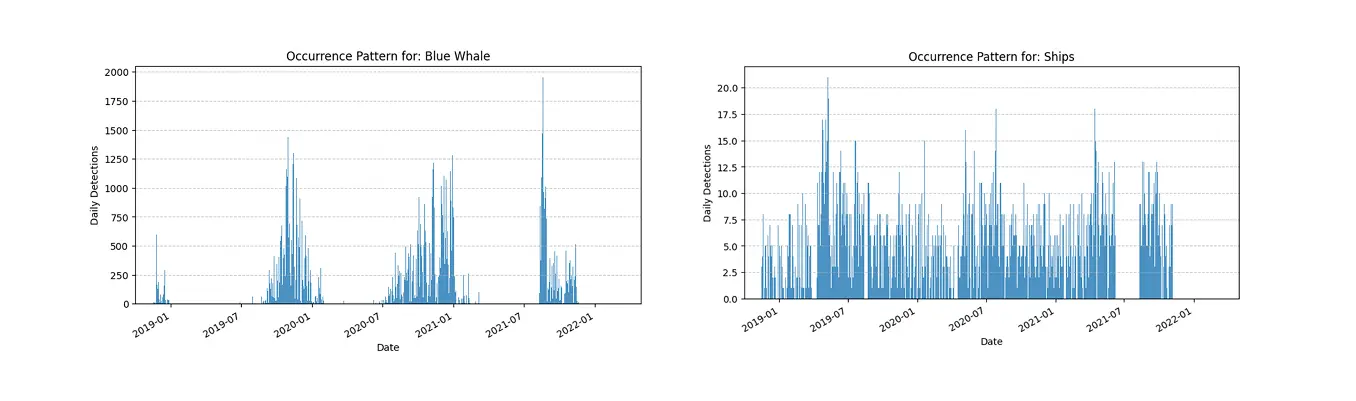
The seasonal patterns of marine animal presence, driven by natural migration, contrasted sharply with the year-round, near constant presence of ships.
Machine Learning: Using Perch
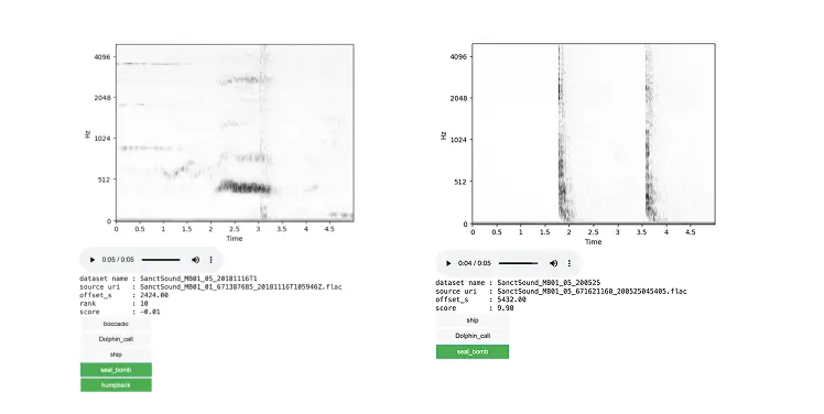
We utilized Google DeepMind's Perch 2.0 bioacoustics model to enhance our analysis at the individual day level, enabling more precise identification of marine species and human sounds in comparison to the NOAA detections.
After consultation with researchers at Google DeepMind, we performed an agile modeling workflow using Google Colab Notebooks, which involved creating embeddings of the recordings and training a custom classifier for each sound type.
This approach allowed us to compute over 10 days worth of recordings at a detailed level for use in the Day view of our visualization.

Agile modeling workflow
Outputs from training classifiers
Refining Approach & Rapid Prototyping
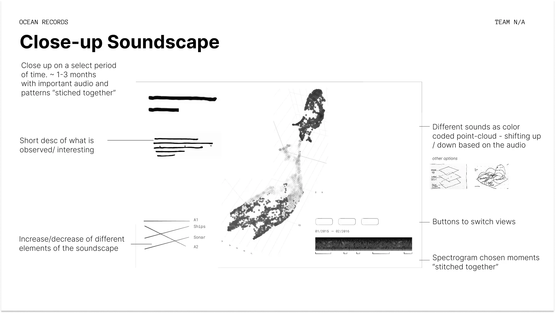
Driven by this insight, we focused our efforts on conceptualizing ways to visualize these patterns effectively at a variety of timescales, both through hand-sketching and rapid prototyping in code.
Global View sketch
Day View sketch
Visualizing detection data using Python and matplotlib

Prototyping visualizations using SvelteKit and D3.js
While we continued to iterate based on feedback from domain experts and our peers, we defined 3 key goals for our final visualization:
Creatively show the overlaps in frequencies between ships and animal calls.
Create an emotional reaction to the prevalence of anthropogenic noise even within sanctuary areas like Monterey Bay.
Showcase how passive acoustic monitoring offers a multi-dimensional look into marine ecosystems.
Design Iteration
We went through a number of rounds of iteration based on feedback from critics and peers. We used Figma to create screens at a mid-fidelity that outlined the general structure and elements of the visualization, before working directly in code to implement the design.

We aimed to incorporate the ability to hear the actual sounds either through hover or autoplay at each temporal scale to create an immersive experience.
Visual Identity
Inspirations
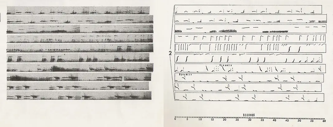
Songs of Humpback Whales (1971), Roger Payne & Scott McVay
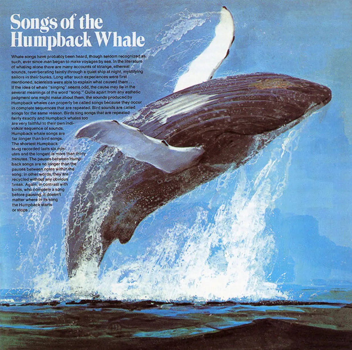
Songs of the Humpback Whale (1970) album cover

Multicolored krill found in the Pacific Ocean
Identity
I designed a custom Mapbox style and a consistent visual identity for use across the visualization.
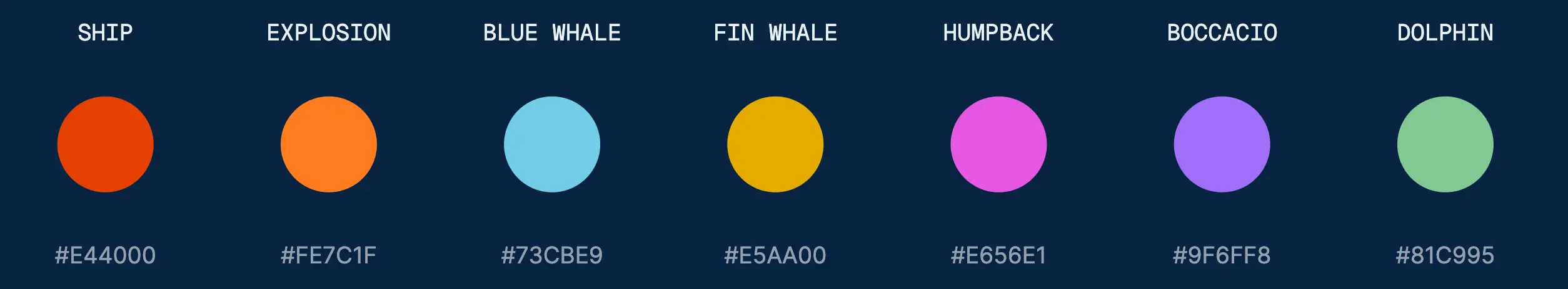
Colors

Fonts
Custom Mapbox style
Reflection & Next Steps
This visualization was a chance to explore the intersection of bioacousitcs, design and data, and was incredibly rewarding to deep dive into.
Going forward, we are hoping to expand the amount of recordings analyzed using Perch as well as incorporate historical shipping data on the map.
We are in the process of showcasing this work to NOAA and others at Google DeepMind.